493 - 28mm Painting Help Needed, Please!
Hullo, All.
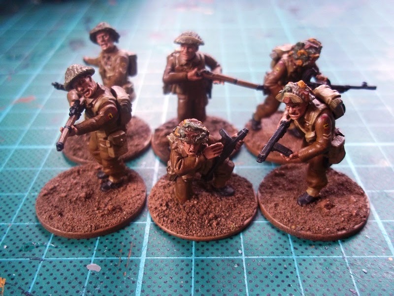
Much to my surprise I've been enjoying the process of painting my Bolt Action British troops, but I have a worry: they appear rather dark.
In my ongoing bid to 'grow up a bit' and try paints other than Citadel (which are excellent, but which keep changing!) I thought I'd try some of the well-regarded Strong Tone. It seems more-or-less on a par with GW's Sepia anyway, BUT now I've used it, I'm a little worried that my minis look a wee bit too dark even for me...and I like 'em grimy.
My question is: what can I do, please, to either lighten them up a little or bring them a little more dynamism.
I do realise that once the bases have some greenery on them they'll look less severe, and I love that they look infinitely better than they did before Strong Tone, but I'm still a little frustrated. I suspect one of you might advise me to repaint the lighter colours, but I don't want them to end up looking like the Warlord Games Studio Brits - as if they've just Blanco'ed all of their webbing and khaki [see here: link] - so I thought I ought to ask for your help first.
In case you can't see it(!) I've used the dreaded 'autocorrect' to adjust this next picture a little so that you can just about see the red details above and below the Black Bull: the curved red regimental title and the red 'arm of service' stripe [excellent research notes on these, incidentally is to be found here: (link)]: I painted these an appropriately muted red before, but now they seem too muted.
Likewise the NCOs' stripes: I'm fairly pleased with them, but ought I to have painted them white in the first instance, rather than 'biscuit' (Bleached Bone)?
Any help you can offer, Dear Readers, will - as ever - be gratefully received.
Yours hopefully,
- Drax.
PS: I'm rather worried that the chap on the left rather has the look of Nigel Farage about him...or should that be 'on the right'?


Honestly I think you're being too critical Drax, they look superb - the muted color tones definitely feel very gritty and realistic - they definitely have the look of having been in the field for quite some time. Love the insignia, the bleached bone color is way more suitable than a stark white - afraid that would look a bit too cartoony. Adding a little greenery to the base will assuredly make them pop, perhaps one more light khaki drybrush pass on the ground to lighten it up just a touch? Of course, if that means having to repaint the entire army to match, then perhaps not! :)
ReplyDeleteSterling work, man - definitely look forward to seeing the final result!
Cheers, Mordian!
DeleteI should point out: not only have I done nothing at all with the base yet (I forgot to mention that I will indeed drybrush it lighter!) but also - this IS the entire army! These are first five: test figures in many ways.
Many thanks!
Sometimes having SOMETHING that is a lighter colour can bring up the whole model. I can see why the store models have very light harness/backpacks....it helps brighten, but also break up the swath of monocolour.
ReplyDeleteCertainly try playing with the basing to see if that works for you...it will save you an additional painting step if it works. Otherwise, I'd try highlighting either the skin, or the uniform (arguably the dyes would probably fade fast and lighten up) to see if that works for you. The uniforms have enough folds that it'd be pretty easy to do some highlighting on them.
I agree with dave. The easiest thing to do here is adjust the basing. Adding some greenery, or moving it away from brown/flesh tones would help the models pop out considerably.
DeleteCheers for such smashing advice Dave!
DeleteI've never yet been brave enough to even think of attempting highlights on cloth, but I might - in a minute - try highlighting the webbing with Bleached bone as I drybrush the bases.
Ditto Greg: sorting the basing seems to be order of the day.
DeleteThank you so much!
I wouldn't be too hasty in doing anything to them until they are based. War is a dirty business and they look like they've been through some mud and grime. Perhaps it's just because they are different to your previous work, or different than you envisaged? Personally, I'd be more than happy with them. I think they look great! They could certainly be in the England gurning team with those facial expressions :-)
ReplyDeleteYeah - hastiness is not usually the hallmark of my hobby, so I will definitely take your advice. In fact, I'm not doing ANY marking or planning tonight, and instead I'm going to attack some bases. Yay me!
DeleteCheers, mate.
Now, these guys are a bit clean as they've obviously been playing "Home Guard" and somehow got out of being drafted, but check out their uniforms - pretty dark with light contrasts from the webbing, etc. Check out also how their pasty white British skintones also contrast against the dark brown - yes, battleworn fellows would have a somewhat dirtied complexion, or maybe not. (Yet)
ReplyDeletehttp://www.paddelaters.com/WW2%20British%20army/home-page.jpg
Strong contrasts help details pop, especially from a distance - hence why the Warlord crew painted their webbing so bright.
Really it all comes down to how you want these figs to look - great from close up, or from the tabletop?
(I like how they look now though and firmly agree with what's been said above on basing.)
What a great pic - thanks, Dai!
ReplyDeleteI 'get' what Warlord have done - it makes sense - but most of the reference pics I've found seem to steer toward the homogenised browniness. Very bland; very British...so yeah, I don't quite want to go for the squeaky-clean look. I think I'll see how stuff looks after some basing.
Great tip about considering 'how I want the figs to look', by the way - cheers!
If you want to try a different paint Vallejo do an English uniform, this with a drop of bone colour then used sparingly only on the higher points of the cloth uniform should bring up the miniatures nicely. I do agree with the sentiment expressed by others that once the bases are done you might not need to go further. Try a couple of the grass and or flower tufts they really work miracles.
ReplyDeleteCheers, Chris - 'English Uniform' is indeed the paint I use (it's a perfect colour), and - as it happened - GW's Bleached Bone is what I've ended up using to highlight (with a very light drybrush) the webbing. I've done it loosely, so it's brought out the cloth a little too.
DeleteAs per EVERYONE'S advice, I've done the basing too now...and it looks smashing - pics soon!
Thanks so much, Chris!
The basing will help. You could try some lighter toned line highlights on straps, webbing, packs, etc. to break up the different areas of brown. Having it spread across the model should stop it being an eye drawer and thin lines should ensure it doesn't end up being an eye sore.
ReplyDeleteThanks, Crosser.
DeleteAs above, I have now attacked them again, and luckily (as I couldn't really face line highlighting) the drybrushing seems to have worked: they really are beautifully designed models, and hopefully now look rather less of an eyesore!
Hey Drax, this post slipped under my radar earlier in the week!
ReplyDeletefirst recommendation from someone who uses strong tone.. dilute it before application - it is a bit "think" for my taste, more like a dip than a wash untill watered down about 50/50
Also, I always do a highlight after strong tone application as in addition to being a bit dark, I find it can also be prone to tide marks, so a highlight helps me cover those and lighten key areas. I'd use a small brush, and often your original base colour is now light enough, but I will sometimes add a tip of a lighter colour if I want it really to pop - and using watered down paint with the excess removes form the brush, just put some lights on.
I'd probably do that for every colour used, but you could easily get away with just the face and webbing to add some contrast points.
think? thick
ReplyDeleteThanks, mate - as I mentioned in the subsequent post, I think I'm going to try some more highlighting on the faces. I 'll try diluting too.
DeleteHmm...
I have the same problem you know. I found that using a light green instead of khaki/beige/brown for the webbing and pouches was enough to add a splash of variety. I used quite a pale green to keep the sort of faded look and didn't use any white for highlight, keeping it still fairly muted.
ReplyDeleteThanks, Leif - and welcome!
DeleteFrom experience, I'd say that the pale green is an ideal approach to faded khaki!
Cheers!